Mike Thompson has yesterday presented the latest and greatest version of the new graphs for RHQ in a video on YouTube. Shortly after he has committed the results of his huge work into RHQ master branch.
While this work is not yet finished, it is the result of the work started by Denis Krusko in last years Google Summer of Code. At the moment both the old and new graphs are can be looked at in the UI, so that you can compare them and potentially report non-matches.
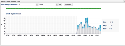
Here are some screenshots to foster your appetite:
Popup chart for a single metric

Individual metric on the monitoring tab
As the subject already says are those graphs made with the help of the awesome D3.js framework - I let Mike chime in to describe in more details what he and Denis had to do to get this to work inside GWT+SmartGWT.
I've uploaded a snapshot from master as of this morning (my time) of this from our CI server onto SourceForge for you to try. THIS IS NOT FOR PRODUCTION.
There is a known issue where the red bar shows "..global exception.." this is harmless and we will fix that anyway. Also the graph portlets in the dashboard don't honor the column width yet.
Please do not forget to report bugs (if there are any :-)
1 comment:
This is an interim release with both charting technologies in place. The reason for this is to make validation between the charting technologies easier as we can now switch back and forth between old and new charting technologies. Hopefully, this will not cause confusion in the interim and shortly the old charts will be removed to leave only the d3 charts.
Post a Comment